

Our portfolio is under construction.
Please add to our portfolio by letting us complete your project!
Alternatively, check back for future updates; you’re going to like what you see.

Before.
This breakfast area started out extremely “blah” with a pale green paint, mismatched blinds, and a boring outdated light fixture. We wanted to make this space bright, cheery, girly, and fun - somewhere to share mimosas with friends.

Concept.
With a limited budget of only $250, we decided to incorporate a hand-me-down oak table, clearance curtains, and various mismatched dining chairs bought at thrift stores for $3-$5 each. We relied heavily on the power of paint to pull this look together.

After.
Since this space leads into the back yard, we really wanted to bring the outside “in”. We went with a fun brighter green paint on the walls & used a sunshine yellow for the door and light fixture. We also incorporated faux deer antlers above the door & a tropical plant as the table centerpiece.

Before.
This bathroom was ready for an update after so many years of use. Our client wanted this room to feel clean, fresh, & inviting. She also wanted to let light in, but with the window looking out so close to the front door, lack of privacy was a huge concern.

Concept.
We decided to open things up a bit with a thinner vanity, lighter linoleum flooring, and to replace the window cover with a patterned privacy cling. We stuck with neutral grey-greens & whites for a fresh chic vibe.
After.
This room is still in the works!

Before.
This kitchen was feeling a little plain and “old-folksy” for our client. She was particularly displeased with her cabinet colors & countertops, but having trouble deciding what combinations (along with backsplash) would work well together.
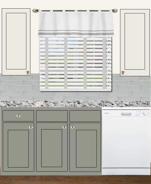
Concept.
We decided to go with a transitional style kitchen to update it a bit without looking too out of place in the rest of her home. We chose a countertop with flecks of green and burgundy (her two primary home colors), and then pulled on that green for her bottom cabinets and backsplash.
After.
In order to keep the room from feeling too heavy and dark, and in order to not clash with her primarily white appliances, we chose off-white paint for the top cabinets and a light cream for the wall paint.